Roses are by far the most popular flowers in the world. Their gentle petals and sharp thorns make an instant dramatic impact. Roses’ colors tell many interesting stories which evolve through time and cultures. We can’t imagine Valentine’s day without them.
But there’s a catch. What does the color of a specific rose actually tell? Is there a difference if you send a single rose or a bouquet? Are red roses saying the same, no matter the shade? We intend to provide you at least a basic insight into the fascinating world of roses’ colors and their sometimes obvious but in many cases very subtle meanings connected with often very complicated symbolism.

At the end of this article, you should be able to understand the message of the rose you are sending or receiving. You should also know how to paint a rose (learn how to draw a rose here) and effectively use it as an authentic gift or a decorative element in a design.
For starters, we’ll provide facts about ten different colors of roses and their meanings. We have already prepared material for at least half a dozen more rose colors in near future, so don’t think about this article as a complete story yet. It will expand soon. And it will probably continue to expand for many more years …
Meanings of Red Roses
Red roses tell a story about desire, longing, love, and passion. What a bouquet of red roses says instead of the sender? ‘I love you!’ Deeper the color, the more ready you are for a committed relationship.

#C21E56 (194, 30, 86) Rose Red (Htmlcolorcodes)
#FF033E (255, 3, 62) Rose Red (Canva) aka American Rose
#CD7687 (205, 118, 135) Rose Red Color (Color-Name)
#C21E56 (194, 30, 86) Rose Red Color (Eggradients)
#BE013C (190, 1, 60) Rose Red (Wikimix)

#FF5454 (255, 84, 84) Rose (Hexcolor)
#C08081 (192, 128, 129) Old Rose aka Ashes of Rose
#C4808A (196, 128, 138) Old Rose Red (Color Combos)
#AB4E52 (171, 78, 82) Rose Vale
#BE013C (190, 1, 60) Rose Red (XKCD)

#B94D58 (185, 77, 88) ICI Paints Red Red Rose
#C1565C (193, 86, 92) Devoe Paint Red Red Rose
#C75361 (199, 83, 97) Glidden Red Red Rose
#E71837 (231, 24, 55) Nanjing Automotive Group Rose Red Solid / Plymouth Antique Rose
#A93B46 (169, 59, 70) Glidden Red Rose Bouquet

#BB5A58 (187, 90, 88) Valspar Paint Deep Rose
#CD6D70 (205, 109, 112) Australian Standard Deep Rose
#A0372F (160, 55, 47) Benjamin Moore Deep Rose
#C28285 (194, 130, 133) Glidden Deep Dusty Rose
#BE594B (190, 89, 75) Diamond Vogel Sweet Baby Rose / ECOS Paints Sweet Baby Rose

#C4375C (196, 55, 92) Pantone Rose Red
#DD727D (221, 114, 125) Pantone Tea Rose
#CB555D (203, 85, 93) Rose Red
#905D5D (144, 93, 93) Rose Taupe
#B17376 (177, 115, 118) Benjamin Moore Burgundy Rose
Meanings of Pink Roses
What is the meaning of pink roses? While the red color of the roses reveals more intense feelings, the sender of the pink roses tries to disclose something gentler, and more sensible. Pink is for admiration, appreciation, elegance, and sweetness.

Of course, there are numerous shades, hues, and tints of pink roses as well.

FF66CC (255, 102, 204) Rose Pink
F9429E (249, 66, 158) Rose Bonbon
F653A6 (246, 83, 166) Brilliant Rose
F64A8A (246, 74, 138) French Rose
FF33CC (255, 51, 204) Razzle Dazzle Rose

#FE28A2 (254, 40, 162) Persian Rose
#C74375 (199, 67, 117) Fuchsia Rose
#D71868 (215, 24, 104) Dogwood Rose
#B3446C (179, 68, 108) Raspberry Rose
#A8516E (168, 81, 110) China Rose

#FF007F (255, 0, 128) Rose Color (HiSoUR)
#A26666 (162, 102, 102) Withered Rose Color
#FF0080 (255, 0, 128) Rose
#FF00CC (255, 0, 204) Rose (Safe Hex3)
#FFE4E1 (255, 228, 225) Misty Rose

#F7CAC1 (247, 202, 193) PPG Pittsburgh Paints Rose Pink / Glidden Rose Pink
#F0D6D7 (240, 214, 215) Porter Paints Rosey Cheeks
#EFD4D5 (239, 212, 213) Valspar Paint Rose Vanilla
#F4D2CF (244, 210, 207) Olympic Rose Radiance
#F7DFD7 (247, 223, 215) PPG Pittsburgh Paints Cameo Rose / Glidden Cameo Rose
White Rose – It’s Color Meaning
What’s the meaning of white roses? They suggest chastity, innocence, loyalty, and purity. White is the color of a new beginning but also farewells, so it’s perfect for weddings. A bouquet of white roses sends a message of recognition. ‘Yes, I am thinking about you!’

#FFEDE7 (255, 237, 231) Rose White (Html Css Color)
#FBEEE8 (251, 238, 232) Rose White (Crispedge)
#EBE0E4 (235, 224, 228) Rose White Color (Color-Name)
#F6FCFA (246, 252, 250) White Rose Color
#FEEEE6 (254, 238, 230) Rose White (Awsmcolor 293)
Purple Rose Color Meaning
Purple roses symbolize magic and are perfect for love at first sight. When you send a purple rose, you clearly admit your admiration of a receiver. After all, purple was reserved for royalty for centuries and is in many areas still used only on special occasions.

#5E2D79 Purple Rose
#B09FCA (176, 159, 202) Pantone Purple Rose
#C0428A (192, 66, 138) Pantone Rose Violet
#CB9AAD (203, 154, 173) Dutch Boy Purple Rose / Sherwin-Williams Rosebay
#CABCD2 (202, 183, 210) Glidden Quaint Purple Rose

#D8B9D8 (216, 185, 216) Crown Diamond Violet Rose
#BE8A97 (190, 138, 151) FolkArt Vintage Tea Rose
#DBA5C5 (219, 165, 197) Devoe Paint Tea Rose Garden
#A4707A (164, 112, 122) Dulux Australia Tea Rose
#D0ACCF (208, 172, 207) Behr Rose Purple
Lavender Rose Color Meaning
still working on it
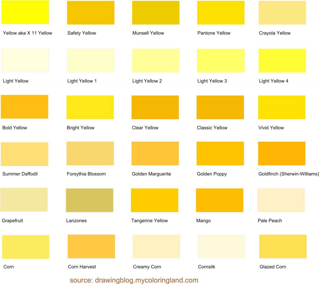
The Meaning of Yellow Rose
Yellow roses are all about happiness and joy. When you send yellow roses to somebody you are celebrating life at its best moments. A yellow rose is probably the least romantic of all and the most suitable for sending to a platonic friend. It simply says: ‘Thanks for making me happy!’

#FFF000 (255, 240, 0) Yellow Rose
#EFBF4D (239, 191, 77) Adonis Rose Yellow
#FAEDC8 (250, 237, 200) Muralo Yellow Rose
#FFDB75 (255, 219, 117) CIL Yellow Rose / Devoe Paint Yellow Rose / Olympic Beach Ball
#FFD76E (255, 215, 110) ICI Paints Yellow Rose / Coronado Paint Country Sun
Did you know yellow roses symbolized jealousy in the 19th century? Getting a bouquet of yellow roses was a public accusation of betrayal or infidelity! It’s not clear how the meaning changed through time, yet it’s probably related to a simple fact – the message in most cases tells more about the sendee than the sender. Somebody who opted for a yellow rose showed himself or herself as a greedy and jealous person.
The role of the messager of such a negative image is nowadays somehow portrayed by a yellow hyacinth.

#FFDA71 (255, 218, 113) Devoe Paint Yellow Rose
#FFD65C (255, 214, 92) Taubmans Yellow Rose
#FFE27C (255, 226, 124) Glidden Yellow Rose
#F4E3A1 (244, 227, 161) Martha Stewart Living Yellow Rose
#F1DCA5 (241, 220, 165) Martha Stewart Living Tea Rose
Orange Rose Meaning
Orange roses communicate energy, fascination, and pride. Orange is a color of enthusiasm, perfect to express admiration to somebody. An orange rose can motivate you too, especially if you want to congratulate somebody on a certain achievement.

A bouquet of orange roses tells: ‘Great work. Keep it up!’

#DB7146 (219, 113, 70) Matthews Paint Orange Rose
#F9EDE0 (249, 237, 224) Behr Apricot Rose
#EF8957 (239, 137, 87) Valspar Paint Tomato Rose
#EB8B6E (235, 139, 110) Valspar Paint Amber Rose
#E98575 (233, 133, 117) Dulux Gypsy Rose
Meaning of Peach Rose
Peach is a shade of orange color. It’s actually a whole family of colors among a larger group. Peach orange colors are so influential they differ from the ‘normal’ orange (although we all know how many details can we find in there).

So, what’s the meaning of peach roses? They send a message of gratitude and sincerity. They are not so often used in romantic connotations as to a friend or a relative, especially to younger ones.
If you simply want to say: ‘Thank you!’, peach roses are the way to go.

#FFE6D8 (255, 230, 216) Light Peach Rose
#FDE2C5 (253, 226, 197) Peach Rose
#F6E3D5 (246, 227, 213) Peach Rose (Photokit)
#FFE3C6 (255, 227, 198) Vista Paint Peach Rose / Behr Fall Straw / Scib Paints Peach Rose / Berger Peach Rose
#FFDDBE (255, 221, 190) Rodda Paint Peach Rose/ Cloverdale Paint Peach Rose
Green Color Rose Meaning
Green is the color of fertility, harmony, health, and stability. Green roses are rare, yet more and more popular, so we’ll probably see more of them soon. On a symbolic level, they are great to send somebody with best wishes for good health.

A green rose sends a message of hope and recovery.

#DBF9DB (219, 249, 219) Light Rose Green
#292D74 (41, 45, 116) Blue Rose
#7D7CC0 (125, 124, 192) Rose Blue
#5C798A (92, 121, 138) Transmitter Shop Rose Blue
#B2B3CA (178, 179, 202) Dulux Blue Rose
As you can see, we managed to find only one green color officially connected to roses, and four for blue roses.

The obvious question is: what do blue roses mean? The meaning of blue roses is extrapolated from their extraordinariness. They represent lust, mystery, and unrequited love. When you know your love will never be fulfilled, a blue flower will say: ‘I love you even if it’s not meant to be.’
Black Rose Meaning
Black is the color of death but also represents authority, certainty, and confidence. Traditionally black roses were sent to enemies (especially very personal, even intimate ones) as a death wish, but nowadays this changed.

A black rose can send very positive messages, like: ‘I am over it. I am ready to move on. Although there is no more us, I believe in myself.’

#1C0506 (28, 5, 6) Black Rose Color (Color-Name)
#532934 (83, 41, 52) Black Rose (Crispedge)
#74053C (116, 5, 60) Black Rose (Hexcolor)
#532934 (83, 41, 52) Resene Black Rose
#88474E (136, 71, 78) Sico Black Rose
Did you spot the differences between black shades named after black roses? Black roses are rare like green and blue ones, so they are also connected to the mystery. So when you wanna say: ‘I am out of your life, and you’ll never know what you missed.’, a black rose can tell this instead of you.
To be continued.